Articles
Aesthetics 3D geovisualization for flood disaster based on the XYZ coordinate
Aesthetics 3D geovisualization for flood disaster based on the XYZ coordinate
Journal of applied research and technology, vol. 21, no. 4, pp. 688-706, 2023
Universidad Nacional Autónoma de México, Instituto de Ciencias Aplicadas y Tecnología
Received: 15 July 2021
Accepted: 04 May 2022
Published: 31 August 2023
Funding
Funding source: Malaysian International Scholarship
Contract number: doctoral scholarship program (2016-2019)
Funding statement: Malaysian International Scholarship (MIS) with doctoral scholarship program (2016-2019)
Funding
Funding source: University Kebangsaan Malaysia
Contract number: GPK-4IR-2020-020
Funding statement: University Kebangsaan Malaysia (UKM) where the project was funded with the project code GPK-4IR-2020-020
Abstract: Geovisualization can convert spatial and nonspatial data into an accurate visualisation of flood models, but the visualised output is less realistic. By contrast, multimedia can produce realistic visualisations by applying aesthetic parameters, but their visualised outputs are not based on data and are therefore inaccurate. This research successfully combined geovisualization and multimedia design techniques to create an accurate and realistic visualisation in flood modelling. An experimental methodology was used to transform flood data via the geovisualization technique, and then the captured objects were mapped in 3D through photogrammetry by using drones. Both modelling techniques were combined by overlapping the X, Y and Z coordinates. Multimedia techniques were used to remodel and animate the captured images, design the interface, prepare the action script, and apply the aesthetic parameters. The success of this study was measured via comparative evaluation, particularly by comparing the model of this research and two other models adopted by previous studies. Results showed that 84.6% of the respondents prefer our research modelling. Then, Cronbach alpha’s reliability test with SPSS was performed for validity checking. Results further showed a significant reliability of 0.935. In terms of theoretical contribution, the proposed modelling can produce flood model visualisations based on accurate data whilst promoting aesthetics. In terms of practical contribution, decision makers can use the proposed modelling when planning for flood mitigation.
Keywords: Geovisualization, Multimedia, Aesthetics, Flood disaster, Modelling.
1. Introduction
Climate change has become the centre of attention, and it has been discussed worldwide (Ruiz et al., 2020; Bevan et al., 2020). Climate change may alter weather components, such as rainfall, temperature, and seasons, in several geographic locations (Escarcha et al., 2018; Ochoa et al., 2018). One of the obvious impacts of climate change is flood disaster. Thus, the public should fully understand such impacts to help them cope with related issues (Bevan et al., 2020). In recent years, many environmental organisations have conducted climate change campaigns to enable the global community to learn more about the topic and ensure that information is widely distributed by various disaster information media (Venter, 1999).
Disaster information media have an essential role in disaster mitigation, as they are used to deliver disaster information to the public through information and communication technologies (Cai et al., 2020; Lou et al., 2020; Ragini et al., 2018). Information is often delivered in three modes: before the occurrence of a disaster (pre-event), during a disaster (actual event) and after the occurrence of a disaster (post-event) (Prajarto, 2008).
As an element of multimedia, animation (and its aesthetics) is one of the most realistic means to deliver information to the public (Guo et al., 2019; Fujimi & Fujimura, 2020). However, the modelling results of multimedia animation cannot be created from spatial and nonspatial data, and the delivered message is usually inaccurate (Ruiz et al., 2020; Rautenbach et al., 2016). The other type of information conveyance is geovisualization whose modelling procedure uses spatial and nonspatial data, so the disaster information is exceptionally accurate (Wei et al., 2020; Atta, 2020). Nonetheless, as a technique, geovisualization does not have an aesthetic value, and the visuals are less attractive; furthermore, as its modelling is highly technical, the public cannot easily understand the information being conveyed (Manovich, 2021, Rautenbach et al., 2016; Zhang et al., 2020).
The purpose of this study is to combine the two methods of geovisualization and multimedia design to model disaster information with high levels of accuracy whilst ensuring its aesthetic value. To identify the appropriate aesthetic elements in the modelling, the appropriate information is analytically identified, and then aesthetic parameters are applied to the 3D modelling process. In the combined modelling technique, the overlapping of X, Y and Z coordinates was considered. Moreover, a user acceptance survey was conducted to measure the success of the aesthetic 3D geovisualization of the flood disaster information, thereby proving the real-world application of the proposed modelling.
In this research multimedia design concepts have been adopted in the storyboards to emphasise aesthetic elements, such as lighting, colour, 2D and 3D field areas, time/motion, and sound. Thus far, aesthetic principles have not been applied to the concept-making of disaster information using storyboards (Fujino et al., 2019; Tallboy, 2021). Accordingly, this research offers theoretical and practical insights. From a theoretical perspective, this research adopts the overlapping of X, Y and Z coordinates to combine geovisualization and multimedia design techniques, thereby producing aesthetic data-driven spatial and nonspatial flood information. The XYZ coordinate method involves placing two different modelling objects on the same coordinate (i.e., XYZ position) to produce a new modelling object (Figure 9). From a practical perspective, this research offers a modelling process for conveying information about the height and extent of flood. Decision makers can use the proposed modelling approach to develop urban plans and concepts or forecast future flooding.
2. Materials and methods
This section describes the data that was used in research and the process of making modeling aesthetics 3D geovisualization for flood disaster based on the XYZ coordinate.
2.1. Materials
The data collected from the literature review were used as basis for ensuring the novelty this research. Past several studies have explored the process of transforming spatial and nonspatial data into flood geovisualization information. Zhang et al. (2020) adopted geographical information system (GIS)-based flood geovisualization modelling and successfully provided accurate information. However, their approach was extremely technical, hindering the public from easily understanding the resultant information. Banerski et al. (2020) used the multimedia technique and tested 3D animation to visualise potential flood disaster scenarios. Their resultant model was aesthetic, allowing the public to understand the provided information, but the output was inaccurate because spatial and nonspatial data were ignored.
If flood modelling only relies on geovisualization, then the resultant information will be accurate but non-aesthetic. By contrast, if flood modelling only relies on 3D animation, then the resultant information will be aesthetic but inaccurate. In this study, geovisualization and multimedia design techniques were combined. 3D animation as a component of multimedia allowed for the development of a modelling approach based on the overlapped XYZ coordinate to convey information that is both accurate and aesthetic.
2.1.1. Flood disaster due to climate change
Climate change has become a widespread concern because of the threat it brings to humans and natural ecosystems (Achakulwisut et al., 2018; Kim & Hall, 2019). As a type of educational information system, the climate change awareness system can help to raise the awareness of communities about climate change adaptation and mitigation, further allowing them to make the right decision and adopt a sustainable lifestyle (UNESCO, 2020). Flooding is one of the known impacts of climate change (Escarcha et al., 2018; Kerns et al., 2018). Disaster information media can help to provide flood information to the public, enabling them to understand and acquire knowledge about flood disasters (Jun & Lihong, 2017).
2.1.2. Currently used disaster information media
Disaster information media are one of the critical sources of information that needs to be delivered before the occurrence of a disaster; as a tool, they also help to build relationships between disaster managers and the community, and they are particularly utilised because affected communities cannot be taught about the disaster whilst it is occurring (Fang et al., 2019; Fujimi & Fujimura, 2020). In panic situations, people may find it difficult to receive information, and they will not likely have the time to watch the television, read newspapers or even look for information on their mobile devices (Fang et al., 2019; Kittipongvises et al., 2020). Media has the power to influence public opinion, both nationally and globally, because the information they deliver has a wide reach (Brien et al., 2018; Zhou et al., 2018). Disaster information media can be divided into two types: printed media (mainstream newspapers, regional and local newspapers, knock-and-drop newspapers, magazines, and journals) and electronic media (mainstream radio, regional radio, mainstream television, niche television and the Internet) (Venter, 1999).
In terms of the stage of delivery, media engagement can be divided into three categories. The first category represents the delivery of information before the occurrence of a disaster (pre-event). At this stage, the role of the media is to convey information about the importance of disaster risk reduction, focusing on awareness and making the right decisions to avoid future disasters. The second category represents the delivery of information during a disaster (actual event). At this stage, the media must provide information on early warning and emergency operations and broadcast mitigation information through multimedia services. The third category represents the delivery of information after the disaster has occurred (post-event). At this stage, the essential task of the media is to integrate disaster risk reduction information into rehabilitation and reconstruction information to further reduce risk (Cheng et al., 2019; Hadimlioglu et al., 2020).
Today’s most widely used disaster information media are electronic media, particularly social media on the Internet, such as YouTube, WhatsApp, Facebook, Twitter, etc. The information conveyed at the time of disaster (event) typically focuses on response mechanisms, hence the reports about ongoing events (Cheng et al., 2019; Fang et al., 2019). Interestingly, any information shared after a disaster would not reduce the number of casualties. Information shared by the media before a disaster is much more useful, as it provides details on how to reduce deaths and material losses. On this basis, electronic media can be used to share flood visualisations even before the occurrence of a disaster (pre-event), in which visualised information can be acquired via disaster simulations (Rezaldi et al., 2020).
2.1.3. Geovisualization for flood modelling
3D geovisualization modelling relies on the 3D visualisation of the earth’s surface; it uses spatial and nonspatial data, which eventually can be enhanced aesthetically (Atta, 2020; Kittipongvises et al., 2020). Geovisualization is widely used to describe flood events, and it supports discussions and collaborative thinking about flood risk management (Matthews, 2017). 3D geovisualizations of flood models can only be created using spatial and nonspatial data (Schaller et al., 2020). Spatial data include geographic coordinates, latitude/longitude or XYZ (Cartesian) square coordinates, digital evaluation modelling (DEM) points, image data, maps, altitude, and a projection of the earth’s dimension (Meng et al., 2019). Nonspatial data comprise the attributes of a location, including annual rainfall, water level, vegetation, population, area, zip code, etc., for revealing the conditions of the area (Evangelidis et al., 2018; Kumar et al., 2019).
GIS data are often used to create 3D geovisualization models of flood disasters, and the output information can be conveyed in different media platforms (Zhang et al., 2020). As 3D modelling produces interactive and accurate information, it is more preferred than 1D and 2D modelling, especially for the risk management of floods or other disasters (Archterior, 2020; Hadimlioglu et al., 2020). Examples of software that can geovisualize flood models are ArcGIS, FME, HEC-HMS, HEC-RAS, ANUGA, XP-SWMM and Google SketchUp (Khaghan & Mojaradi, 2016; Lyu et al., 2018). By using these software, highly technical spatial and nonspatial data can be transformed into useful disaster information, usually in visual formats, for the easy viewing of the public. Regarding flood disasters, the process of transforming spatial and nonspatial data into 3D geovisualizations starts from collecting the required data, then creating a map of flood locations in 2D using ArcGIS and finally importing the map file in Google SketchUp (i.e., a requirement of 3D modelling). The details are shown in Figure 1. The final modelling results from the 3D geovisualization can be saved as images (e.g., PNG, JPG, TIFF, etc.) or video clips (e.g., QTFF, AVI, etc.). Figure 2 shows some examples of 3D geovisualizations generated by previous scholars.
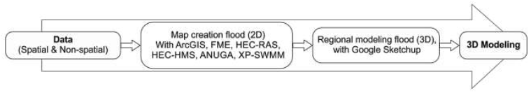
Figure 1
3D geovisualization process (Source: Amirebrahimi et al. (2016) and Yi et al. (2018)).
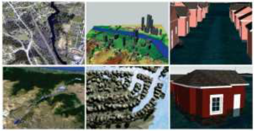
Figure 2
Example of 3D geovisualization
(Source: Amirebrahimi et al. (2016), Adda et al. (2010), Bogetti (2012), ESRI (2021), Diya et al. (2017) and Mufasu (2021).
2.1.4. Building multimedia modelling for floodinformation media
Multimedia applications have been widely used in the simulation and information delivery of natural disasters. They are considered an effective information and education delivery technique because information can be shared and received (i.e., through hearing and sight, and even sense of touch) in a simultaneous and realistic manner (Pushpalatha & Ananthanarayana, 2017).
Multimedia design is the art of combining various media elements using computers. Creativity and technical skills are needed to integrate two or more media elements, such as images and graphics, audio, video, animation, text, numerical data, and illustrations (Zhao & Zhao, 2019). Multimedia modelling is the process of aligning various media types and systems, and it is considered an essential technology for information processing, providing a framework for creating next-generation human-centred information systems (Li et al., 2014). The three techniques of multimedia modelling are the 2D, 3D and interactive approaches (Yi et al., 2018). Meanwhile, multimedia can be divided into two types. The first type is linear multimedia, which do not require navigation controls. Users of linear multimedia are passive recipients because they only accept the content presented to them. The second type is nonlinear multimedia, which are accompanied by navigagation controls. Users of nonlinear multimedia can select a range of desired contents, indicating a two-way communication between the presented content and the users (Khillar, 2021; Palilonis et al., 2013).
The type of multimedia selected in this study was the nonlinear multimedia. The navigation control of nonlinear multimedia enables users to select the desired content, hence the two-way communication. As for the multimedia products related to flood disasters, education and training products used for educational purposes were selected in this study. The necessary information are the height and distribution of flood areas within the research site, as obtained from databases of past flood events. Information can be conveyed through sound, animation and interaction, and appropriate multimedia products can be created by exploring various behavioural design ideas at the beginning of the design process. Behavioural design ideas can be expressed through storyboards in the form of sketches and computer-generated images. Sketches allow designers to explore and communicate ideas more quickly (Fujino et al., 2019; Neo & Neo, 2013). In graphic illustration, concept-making through storyboards is a planning process involving the creation of blueprints for a final output. Storyboards display several illustrations or images in sequence. After images or illustrations have been selected, a script for narration can be added, and then background sound or sound effects can be included (Fujino et al., 2019; Tallboy, 2021). Here, the analysis, design, development, implementation, and evaluation (ADDIE) model (Carroll, 1999; Fedorov, 2015) of instructional design was used as basis for developing a framework, from prescriptive design to manufacturing/construction.
2.1.5. Role of aesthetics of disaster information media in flood modelling
Nowadays, 3D geovisualization for flood disaster is being performed without applying aesthetics. However, good visualisation cannot be separated from design quality and visual aesthetics, and visual design also implies aesthetic preferences (Guo et al., 2019; Huang et al., 2020; Manovich, 2021). Therefore, aesthetic elements should be considered in the creation of 3D geovisualizations for flood modelling to make the visual outputs attractive, consequently giving a deep impression to users (Cruz, 2021; Xu et al., 2018).
Practitioners conduct aesthetic analysis to decide whether a design medium should be continued or terminated. If users view the design as unattractive, they will not likely use the medium (Shelley, 2009). Aesthetics comes from the Greek words ‘aisthanomai,’ which means ‘I saw’, indicating sensory perception. The most common meaning of aesthetics is beauty. By referring to design principles and techniques combined with media studies, adopting aesthetic elements means creating attractive information and experiencing beauty through media (Kronig, 2018; Manovich, 2021). The study of aesthetics relies heavily on sensing and feeling, empathy and intuition (Eidinow & Ramirez, 2016). Adopting more aesthetic concepts means media information can be more easily understood and recalled by users (Lamarque & Walter, 2019).
Applying the aesthetic concept in media involves the process of adding several elements, such as light, colour, 2D and 3D field areas, time/motion, and sound (Fedorov, 2015; Matthews, 2021; Zettl, 2010). Light is a key element of visual perception, directing users to view space and time in a certain manner, further influencing their emotions. Colour represents visible light in spectral waves; that is, eyes receive a specific wavelength of light. As a design element, colour is crucial in manipulating aesthetic preferences in visual arts. The 2D field area is a screen area used as a frame for presenting the media’s view. It helps to control space via the aspect ratio of screen width to screen height. The 3D field area is a projection of a 3D world onto a 2D surface. It represents the depth and volume of a visualisation. Common examples of media outputs depicting a 3D field area are videos and films, computer displays, paintings and photography. Time/motion is a measure of time of visual work, and it is commonly depicted as duration, change, causality, repetitive phenomena, cycles, rhythm, and movement. When conveying disaster information through audio-visual media, sound and image are two elements that cannot be separated and must be treated as a single harmonious unit.
Natural disasters do not always have to be visualised as a scary incident in multimedia. Hayao Miyazaki, an animation director from Japan, created ‘Ponyo on the Cliff’ to visualise tsunami as a sinister and destructive force whilst ensuring aesthetics and sensitivity. In Miyazaki’s opinion, describing natural disasters as an evil element is unnecessary (Cruz, 2021). Noel Carroll, a contemporary art philosopher from the US, presented natural disasters in subtle and beautiful forms whilst presenting their destructive nature (Carroll, 1999). Although the works have good aesthetic value, they are not based on real events (i.e., spatial and nonspatial data are ignored); hence, the visualisations have no accuracy value (Guo et al., 2019). On this basis, this research focuses on the visualisation of flood disasters. Accuracy is ensured by considering spatial and nonspatial data, but aesthetics is also ensured by combining 3D and multimedia geovisualization techniques.
2.2. Methods
The proposed methodology can be generally described as data processing and 3D geovisualization. Starting from the X-axis (i.e., data points), we further process it using multimedia tools to determine the overlap of X, Y and Z coordinates. Then, we explore a creative design strategy that integrates the aesthetic value and the hierarchical navigation structure. The following subsections describe the method of aesthetic 3D geovisualization to deliver flood disaster information.
2.2.1. Geovisualization
Firstly, the spatial and nonspatial data of past flood events of the research site were collected. For the nonspatial data, we used water level, river elevation, simulation comparisons and error rates during floods, high rainfall, water overflow and maximum flood height. The data were inputted on Fortran, a software for processing the numerical data of maximum flood height (Figure 3). Then, the data points shown in Figure 3 were geovisualized in 2D by using ArcMap tools (Figure 4).
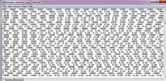
Figure 4
2D modelling in ArcMap.
Then, the spatial data of a flood location, including maps, Google Earth screenshots and DEM (Figure 5), were processed using ArcScene tools for 3D geovisualization. Figure 6 shows the 3D modelling result. This layer would comprise the bottom part of the 3D flood model in this research.
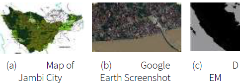
Figure 5
Spatial data used in the modelling.
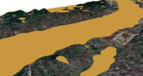
Figure 6
3D modelling result in ArcScene.
The top layer was created by incorporating buildings and the surrounding environment. Drone-captured aerial photographs were processed using Agisoft PhotoScan in the creation of the model’s top layer.
Photogrammetry (e.g., using drones to capture aerial photographs) can be used to accurately map flood locations. Here, only a part of the area of the map was captured (Figure 5). The corresponding coordinate points of the photographs shown in figure are listed in Table 1.

Two drones, namely, DJI Mavic 2 Pro-Type and DJI Phantom 4 Pro Obsidian, were used to capture the mapping area. DJI Mavic 2 was used to take aerial photographs, whilst DJI Phantom 4 was used to take an aerial video. Both drones were flown in autopilot setting by using the PIX4D Capture software (Pix4D Training, 2021). The drone shots consisted of hundreds of photographs at 1:1 scale, and all of them needed to have the correct coordinate instrumentation. Figure 7 shows some of the successfully generated aerial photographs.
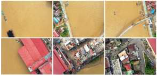
Figure 7
Aerial photographs captured by the drone.
The next step was to build an orthomosaic 3D model by using the 261 photographs captured by the drone. The photograph resolution was 600 pixels/inch, and the pixel dimensions were 5472 × 3648 pixels. The selected photograph resolution and sizes were essential in ensuring the quality of the final modelling result. The higher the resolution, the better the image quality (Firoz et al., 2018). The Agisoft PhotoScan professional software (Agisoft, 2018) was used for photogrammetry prior to 3D modelling. This full modelling process is shown in Figure 8.
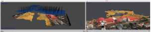
Figure 8
Result of orthomosaic building process in Agisoft PhotoScan.
2.2.2. Setting the X-axis
The step of setting the X-axis is important in equalising the position of the coordinates between two geovisualised objects (i.e., the outputs of the previous stage). The 3D model from ArcScene and the orthomosaic output of Agisoft PhotoScan are shown in Figures 6 and 8, respectively. The process of setting the X-axis was performed using Cinema 4D tools.
2.2.3. Multimedia process
The objective of this stage was to perfect the modelling and orthomosaic stage whose results had been less than optimal even though the size and shape of the images follow the original coordinates. Several objects considered to be less than optimal were remodelled without changing their volume, size, shape, or coordinates. This stage was performed using the Blender software. The results of this process are shown in Table 2.

2.2.4. Overlapped XYZ coordinate
Identifying the overlap of the X, Y and Z coordinates is the theoretical contribution of this research. Here, geovisualization and multimedia design techniques were merged into a single process to determine the overlapping position of a certain image on the same coordinates (i.e., the overlapped XYZ coordinate). A preview of the overlapping technique is shown in Figure 9.
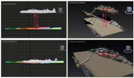
Figure 9
3D modelling by combining DEM and photogrammetry into a single unit (Theoretical contribution).
The combination process of the 3D modelling based on DEM (Figure 9) was continued by adding flood animation. On this basis, the practical contribution of this research is the integration of the height information of flood (Figure 10) and its animation.
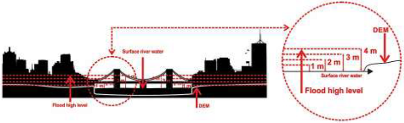
Figure 10
Integrating the height of flood based on data. (Practical contribution).
Figure 10 shows the core step of adopting the flood height and flood distribution area from the DEM results. In determining the flood height, a straight line was drawn from the lowest point in the field to the highest point of the building located at the lowest end area. This approach implies that flood height would differ in each area because of the uneven ground contours. Ruler tools in Google Earth were used to determine the height of the building. After the size of the building was obtained, a scale comparison with the building was performed to obtain each flood height (in metres).
The final 3D geovisualized flood model can also be used to show the flood height (i.e., its side view) and the flood distribution area (i.e., top view), as shown in Figure 11.
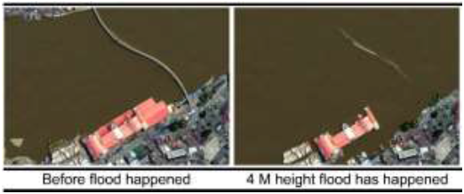
Figure 11
Rendered top view of 3D geovisualization in the flood modelling.
2.2.5. Creative design strategy
This stage about creative design strategy represents the content conceptualisation and the design of each page display (Palilonis et al., 2013). Here, the ADDIE model was used to specify the initial data and the generated ideas. As previously mentioned, ADDIE refers to analysis, design, development, implementation, and evaluation (Carroll,1999; Fedorov, 2015).
-
Analysis: The target audiences/users (specifically, community members living within the flood disaster site aged between 17-35 years) were determined. According to the literature (Matthews & Thorsen, 2020; Rachmad, 2017), audiences aged 17-35 years are mentally and physically fit and have a good memory, and they can easily understand and recall the information presented to them. Besides, people at this age not only can save themselves during a flood but also the others around them (Rachmad, 2017). From a behavioural aspect, audiences aged 17-35 years are the ones who often search information through the Internet. In this research, the dissemination period of the media information was six months.
-
Design: The design aspect in this research included cognitive, psychomotor, and affective elements. Cognitive orientation implies that audiences can understand, recall, and apply the information given to them. On this basis, the design concept centred on icon creation (Illustration 1). The psychomotor aspect implies that members of the community can be forged with skills and abilities to save themselves and others during a flood. On this basis, the design concept centred on pictogram creation (Illustration 2). The affective aspect is associated to users’ behaviours, attitudes, and emotions in relation to responding to situations and caring for the environment. On this basis, the design concept centred on symbol creation (Illustration 3).
-
Development: The development stage of the production process is related to the conceptualisation stage of the design process. Development consists of three phases: the pre-authoring phase, which includes preparing, designing, making decisions and executing the media elements; the authoring phase, which includes transforming the analogue designs into digital designs using a software to create features and interactive links and integrating media elements into the page design; and the post-authoring phase, which includes finalising the design for application and distribution and identifying the metrics to be used for evaluation and validation.
-
Implementation: Before distributing the application to audiences/users, the modelling tool must be evaluated by respondents with competencies in visual communication design. YouTube and Google, which can be accessed using smartphones or computers/laptops, were used in this stage.
-
Evaluation: In this research, the results were initially evaluated via a pilot survey to ensure that all procedures had been correctly implemented. The aim of evaluation was to further improve the outputs and processes of the proposed modelling. After improvement, the output was shown again to the respondents, and a questionnaire was used as an evaluation instrument to obtain their feedback. The last step of the evaluation was to measure the success rate and validate the enhanced modelling via Cronbach’s alpha reliability test.
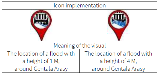
Illustration 1
Sample icons used in the modelling.
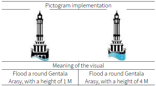
Illustration 2
Sample pictograms used in the modelling.
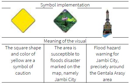
Illustration 3
Symbols used in the modelling.
The storyboard approach allows for the creative concepts to be delivered as an interactive media content and the visual concepts to be applied as a 3D model (Tallboy, 2021). The storyboard developed in this research contained a detailed explanation of each image and the aesthetic elements corresponding to each image. Different aesthetic elements, such as lighting, colour, 2D and 3D field areas, time/motion, and sound, were considered in the modelling process. To the best of our knowledge, using storyboards and integrating aesthetic elements are a novel approach in presenting disaster information. Figure 12 shows an example of the storyboard developed in this research.
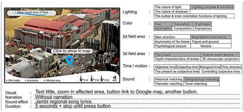
Figure 12
Storyboard used for the modelling design.
An icon is a sign for visually presenting a reference source (Chi et al., 2019). Several icons were used, including the buttons for URLs linked to flood modelling pages. Then, cognitive design was applied to allow the users to familiarise themselves with the concept, hence making it easier for them to understand, recall and apply the presented materials (Wertz & Moya, 2019). The icon design used in this research was like many URL link designs, and only a visual object of the clapper building, and the picture of the flood height were added. Through the icon, the flood height can be manipulated from 1 to 4 meters, as shown in Illustration 1.
Pictogram is a graphic symbol representing an idea (i.e., an ideogram) to convey its meaning through images, mimicking the physical state of the actual object (Rosa, 2015). The pictogram design in this research was selected in accordance with the Gentala Arasy Tower, a symbol of Jambi, Indonesia. A pictogram design reflects the psychomotor design concept, and users can respond appropriately based on the information provided to them (Hoque, 2017). Here, the design goal was to create a community around the Gentala Arasy Tower, and residents need to save themselves and help others during a flood. Examples of pictograms used in the modelling are shown in Illustration 2.
Symbol is a sign with a specific visual meaning (Fedorov, 2015). The symbol used in the modelling is shown in Illustration 3. The design was created based on the concept of an alert or warning being sent to audiences. This design approach is an affective idea (Hoque, 2017), as the modelling was also aimed at influencing the behaviour, attitudes and emotions of audiences, particularly those who live near flood-prone locations.
2.2.6. Implementation of aesthetic value
The visual attractiveness of a medium is influenced by its applied aesthetic value (Huang et al., 2020). Currently, the application of aesthetics in modelling is based on functions, but planning the concept is often ignored. In this study, aesthetics values were applied based on a clear planning concept. Aesthetic elements (i.e., lighting, colour, 2D and 3D field areas, time/motion, and sound) were applied at the production stage using a multimedia software. Aesthetic elements were also applied to 3D animated objects and basic images using Blender and Adobe Photoshop, respectively.
For the 3D animation, the aesthetic elements were utilised as follows:
-
Light: This element serves to direct space and time and influences the audiences’ emotions. The lighting types used in this research were meant to deliberately control light and shadow. In this manner, audiences could easily understand what objects needed to be viewed. The objects’ placing and texture could also affect the users’ feelings during viewing.
-
Colour: The primary attributes considered in this study were hue and saturation. The brightness of colours was adjusted accordingly to ensure that the objects would appear like the original material. The colour settings applied in the modelling process served as another form of information to reinforce the shape of each created object.
-
2D field area: This element refers to the screen’s scope, forming the image’s frame based on its width and height. The 2D field area used in the modelling entailed a magnetic frame for the display. Standard high-resolution images (1920 × 1080 pixels) could be viewed on a computer screen or monitor.
-
3D field area: The 3D plane area in the modelling was based on the Z-axis of an image, and then the X, Y and Z coordinates were overlapped to frame the image and establish its lens depth characteristics. In camera view, this method could give a sense of 3D depth.
-
Time/Motion: This element allowed for animation to be utilised in the modelling. Blender was used as the animation software, and the time aspects, such as the animation motion per frame and the camera motion per frame, were executed. The number of frames would affect the animation duration.
-
Sound: The Jambi regional song entitled ‘Rang Kayo Hitam’ was played in acoustic (guitar version without the singer’s voice). The sound was processed using the CoolPro editing software. Sound was also used to define the function or orientation of the animation and geographic matching (e.g., a certain music was played for geographic area). As for the image processing, the aesthetic elements were utilised as follows:
-
Light: For the main page design requiring an interactive visualisation media, a type of lighting and the corresponding function were used to deliberately control the light and shadow. In this manner, users could easily recognise the objects. The background was applied with a certain texture.
-
Colour: The primary colour used to design the page display was blue with hue, saturation, and brightness settings (i.e., gradation from light blue to dark blue), as the psychological meaning of blue is calmness. Meanwhile, yellow was used to depict a psychological sense of carefulness and alertness. In other words, colour was used to manipulate the psychological meaning of the images, i.e., being cautious and careful and staying calm in the face of a disaster.
-
2D plane: The screen or frame of the 2D plane served as the magnet of the frame, constraining the image space, and focusing on the centre point as the visual centre. The frame size was adjusted to fit the best-resolution requirement of a computer monitor screen, which is 1920 pixels (length) × 1080 pixels (width).
-
3D field area: 2D surfaces were presented with depth and volume so that they would look like 3D images. The 3D field area technique was used to visualise the depth of each object, particularly by using effects such as drop shadows and inner shadows in Adobe Photoshop.
2.2.7. Hierarchical navigation structure
The hierarchical navigation structure, also known as the linear structure, is an interactive display technique for presenting flood models (Binanto, 2013). In this system, the homepage is positioned at the top part, followed by several category pages below it that are broken down into different sub-category pages. A back-link to the homepage also appears on each page. With this type of interaction, users can explore the virtual space’s appearance freely.
After creating the navigation structure followed by the interaction production, design elements (video, sound, icons, symbols, buttons, and graphics) were integrated. All these items could be organised into a single-page design view and assigned an action script for each control. In this manner, the different pages could be linked to each other via the navigation structure. This process was implemented in Adobe Flash Professional. Some examples of the action scripts are shown in Diagram 1.
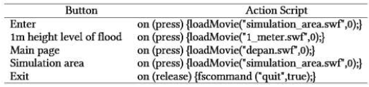
Diagram 1
Example of action script used in the modelling.
After completing the action script, the flood modelling of Jambi City would be ready for use. The result of the modelling is an executable (*.exe) file application. The overall visual appearance is shown in Figure 13.
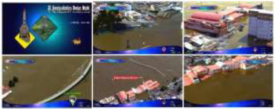
Figure 13
Final visual design of the aesthetic 3D geovisualization for flood disasters based on the XYZ coordinate.
3. Results and discussion
After completing the aesthetic 3D geovisualization of the flood disaster model and before distributing the application to audiences, the modelling application must be fully and completely executable. In other words, no errors should appear one the application is distributed to users. Therefore, evaluation and validation should be conducted.
3.1. Evaluation
The evaluation was implemented in two phases: (1) pilot survey questionnaire and (2) actual questionnaire instrument.
3.1.1. Pilot survey questionnaire
The questionnaires were distributed to 100 students majoring in visual communication design from several universities in Bandung, Indonesia. The sampling technique was in accordance with nonprobability sampling (Anson et al., 2017) combined with purposive sampling (Poudel, 2016). The respondents were gathered in a classroom in their respective universities, and they were instructed to watch flood modelling techniques and answer the questions displayed on their computer monitors. The three flood modelling techniques are shown in Tables 3(a) to (c). The first technique refers to the aesthetic 3D geovisualization proposed in this study, whereas the two remaining techniques represent those from previous studies. The respondents were asked to answer fifteen questions. The aesthetic parameters measured were lighting, colour, 2D field area, 3D field area, time direction, ‘most preferred’ elements, sound effects and soundtrack. The questionnaire results were then used as inputs to further improve the modelling process.

According to the pilot survey results, lighting was the most prominent element of the aesthetic 3D geovisualization. Colour helped to distinguish the images and animation outputs. For the images, building 3D geovisualization (Table 3(c)) outperformed the two other modelling techniques in terms of colour contrast. For the animation, the aesthetic 3D geovisualization (Table 3(a)) outperformed the other two techniques in terms of colour contrast. For the 2D field area elements, the map 3D geovisualization (Table 3(b)) attained a better-balanced composition compared with the two other techniques. However, the design was most balanced in the aesthetic 3D geovisualization (Table 3(a)).
For the 3D field area elements, the images and animation in the aesthetic 3D geovisualization (Table 3(a)) were the most realistic than those of the two other techniques, and they were even like the original objects, which is the surrounding building that is in the actual environment, not an engineered building model. For the time direction, the aesthetic 3D geovisualization (Table 3(a)) was the most capable of displaying information about the time of the flood event (pre-, actual, or post-event). Most of the respondents selected the visual images and animation of the aesthetic 3D geovisualization (Table 3(a)) and even recommended them for use and development in future research. Aimed at highlighting the aesthetics, we added rippling water sound effects accompanied by a traditional music soundtrack to offer a better geographical impression of the area. The pilot survey recommendations were considered in perfecting the prototype of the aesthetic 3D geovisualization (Table 3(a)), and then the technique was re-evaluated using the actual instrument questionnaire.
3.1.2. Actual questionnaire instrument
The actual questionnaire consisted of 20 questions. As an improvement of the pilot survey questionnaire, the actual questionnaire instrument was used as an essential measuring tool. For fairness in comparison, we used the same disaster information media and the three modelling techniques (i.e., Tables 3(a) to (c)) to depict the improvements of the prototype in relation to the pilot survey results.
The questionnaire, which was constructed using Google Forms, was distributed through e-mail and WhatsApp to 100 respondents who are experts in visual communication design. The aesthetic elements used in this actual survey were the same as those in the pilot survey (e.g., lighting, colour, 2D field area, 3D field area, time direction, ‘most preferred’ elements, sound effects and soundtrack. However, at this stage, measuring elements were added, such as the ‘most liked’ and the ‘most recommended’ elements. The sampling technique was the nonprobability sampling method (Anson et al., 2017) combined with purposive sampling (Poudel, 2016). The actual questionnaire results are shown in Figures 14 to 17.
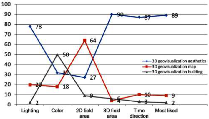
Figure 14
Questionnaire results for imaging.
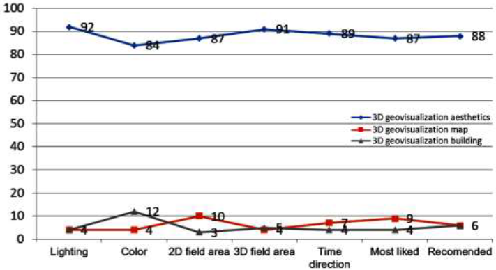
Figure 15
Questionnaire results for animation.
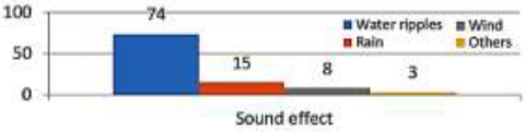
Figure 16
Questionnaire results for the sound effect.
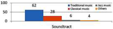
Figure 17
Questionnaire answer for the soundtrack
According to Figure 14, the aesthetic 3D geovisualization (Table 3(a)) outperforms the other two techniques in terms of lighting, as this element allows the shapes and textures of objects to be highly visible. In terms of colour, building 3D geovisualization (Table 3(c)) offers the best contrast. In terms of 2D field area elements, the composition of map 3D geovisualization (Table 3(b) was the most balanced. In terms of 3D field area elements, aesthetic 3D geovisualization (Table 3(a)) was the most realistic. As for the time direction, aesthetic 3D geovisualization (Table 3(a)) was the most accurate in terms of the time occurrence of floods. The ‘most liked’ elements were for aesthetic 3D geovisualization (Table 3(a)) given its integration of aesthetic principles.
According to Figure 15, lighting, colour, 2D field area, 3D field area and time direction are the most liked and recommended elements. Aesthetic 3D geovisualization (Table 3(a)) was the modelling technique most preferred by respondents. This finding can be attributed to the highly visible shapes and textures of objects. Aesthetic 3D geovisualization (Table 3(a)) also attained the best contrasting colours, balance composition and time direction, and its images were the most realistic. The visual appeal of aesthetic 3D geovisualization (Table 3(a)) is the most recommended by respondents given its integration of aesthetic principles.
Figure 16 indicates that using sound effects is appropriate for animation because they clarify the atmosphere and highlight the geographic location of flood occurrence. Here, sounds of water ripples, rain and wind were utilised. Moreover, Figure 17 indicates that using a soundtrack is appropriate for animation. Here, the traditional music of the are affected by flood was utilised, hence reflecting the geographical location of the flood incident.
The results from the actual questionnaire (i.e., modelling applied aesthetic values) can be described as follows. The shape and the texture of visual objects appear clearer when aesthetics principles are integrated, and they attracted the deep interest of users and their better understanding. Visual display should be centred on the screen, giving the impression of a balanced composition. Lens depth and graphic depth also allow aesthetic 3D geovisualization to present disaster information in a more realistic manner.
The respondents’ answers also indicate that the use of aesthetics enables the information to be conveyed more effectively, especially when displaying visual cues for pre-, actual, and post- flood events. Adding water ripples, accompanied by traditional music, enhances the realistic impression. Overall, the aesthetic 3D geovisualization of flood disaster is the most preferred modelling technique and even highly recommended by the respondents.
Different responses were found amongst images and animation for the same measuring element, such as the 2D field area element. All respondents liked the images in the modelling; however, after seeing the animation, they changed their minds and selected it as the better choice. Therefore, images could not be compared with animation. For accurate measurements, we recommend comparing between two images or comparing between two animations.
The overall evaluation results showed that 84.6% of the respondents agreed to the use of aesthetic parameters in flood modelling because they convey more realistic disaster information to users. The information conveyed include visual cues that could be easily understood and accepted by users. Aesthetic 3D geovisualization (Table 3(a) is highly recommended for delivering information about flood events.
3.2. Validation
To validate the modelling, we performed Cronbach alpha’s reliability test by using the SPSS software. Before evaluating the modelling technique by using the actual questionnaire instrument, we firstly validated the respondents’ answers from the pilot survey to measure the questionnaires’ validity or suitability to obtain data from respondents. For the validity test, Pearson’s product-moment correlation was conducted based on the principle of linking each question’s score to the respondents’ answers (Isaac & Chikweru, 2018).
In the assessments, each question could be scored different. For the techniques shown in Tables 3(a), (b), and (c), the scores were 3, 2 and 1, respectively.
The validation results for the questionnaire based on the Cronbach’s alpha reliability test affirmed that the outputs are trustworthy (Adeniran, 2019). For the reliability test, if the Cronbach’s alpha value is >0.60, then the questionnaire is dependable or consistent; if the Cronbach’s alpha value is <0.60, then it is unreliable or inconsistent (Wiratna, 2014). The questionnaires, which consisted of 15 questions, were distributed to 100 respondents. The questionnaires were calculated in SPSS. The summary of case processing, reliability statistics and total-item statistics are shown in Tables 4 and 5.


3.3. Discussion
Our findings present a new breakthrough in the field of multimedia design. For instance, although many animators can perform flood modelling with high aesthetic value, the information they present are inaccurate because spatial and nonspatial data are ignored. The overlapping XYZ coordinate method used in this research can solve the gap. The contributions of this research are further discussed in the following subsections.
3.3.1. Findings
Several aesthetic parameters are being used in flood modelling, and the approaches are even analysed. However, the modelling techniques ignore the importance of a well-planned concept, and the parameters are only used as functions. The integration of 3D geovisualization and multimedia design techniques through the overlapping XYZ coordinate method allows for flood modelling to be based on accurate data whilst ensuring the model’s aesthetic value.
Several creative strategies support the success of our integrated modelling technique, including using storyboards, adding aesthetic parameters, compiling initial ideas from ADDIE modelling development and creating icon designs, pictograms, symbols, and media delivery concepts.
The modelling was evaluated using a questionnaire that then validated by Cronbach’s reliability alpha test whose result was 0.935. This value showed a significant level of reliability or consistency. Hence, the result of this questionnaire is valid, and the aesthetic 3D geovisualization modelling for flood disaster proposed in this study can be implemented. The evaluation results showed that 84.6% of the respondents prefer the aesthetic 3D geovisualization modelling for conveying information about flood disasters. The use of aesthetic parameters can ensure a more communicative, realistic, easy-to-understand information delivery about floods.
3.3.2. Research contribution
In the field of technology and multimedia, this research has both theoretical and practical contributions. From a theoretical perspective, the aesthetic 3D geovisualization of flood disaster is a novel concept in the field of flood disaster modelling. This study succeeded in combining 3D geovisualization and multimedia design techniques to produce visualisations based on spatial and nonspatial data whilst promoting aesthetics values. The overlapping XYZ coordinate method contributes to the modelling, especially since spatial and nonspatial data are both utilised. In other words, even if data-driven geovisualization is adopted, aesthetics can still be applied when multimedia elements are carefully conceptualised. Multimedia design through storyboard creation is one of the notable contributions of this study, particularly the addition of aesthetic elements, such as lighting, colour, 2D and 3D field areas and time direction/motion, in multimedia production.
As for the practical contributions, the overlapping XYZ coordinate method can benefit geology and limnology researchers who usually create flood modelling via geovisualization techniques. This method is also helpful for the animators in the multimedia field. Thus far, most multimedia animators produce flood animations based solely on estimation instead of data. Here, flood height data were obtained through DEM, and flood animation was created based on spatial and nonspatial data. This modelling approach is highly recommended for delivering flood disaster (i.e., pre-, actual, and post-event) information to people living near flood areas. With the ability to determine the height and distribution of flood areas, our prototype can be used as a source of information by decision makers who are engaged in mitigation planning and flood management.
4. Conclusion
When effectively combined, geovisualization and multimedia design techniques contribute to the accurate and realistic visualisation and enhanced conveyance of flood disaster information. Flood models created using geovisualization and multimedia design tools can help viewers to appreciate more vividly what they see on monitors as the real thing. The aesthetic 3D modelling technique proposed in this study, which also entails validation and evaluation metrics, is more effective than the modelling techniques reported in previous studies. Moreover, realistic models help users to easily understand and recall what they have viewed on monitors. Our aesthetic 3D modelling adopts the overlapping XYZ coordinate method, which may be regarded as a geovisualization and multimedia design breakthrough. Adding aesthetic elements, such as lighting, colour, 2D and 3D field areas, time direction, sound effects and soundtracks, enables the visualisation of flood disasters to be more realistic, attractive, and interactive. A prototype of the proposed modelling tool was successfully created in this study. Subsequently, the height and area of flood distribution were realistically simulated. The aesthetic 3D geovisualization modelling of flood disaster is an essential addition to the advancement of geovisualization and multimedia design.
Acknowledgements
The authors would like to express their gratitude to the University Kebangsaan Malaysia (UKM). We would also like to thank the Malaysia International Scholarship (MIS) and the National Research and Innovation Agency Republic of Indonesia (BRIN).
References
Achakulwisut, P., Mickley, L. J. & Anenberg, S. C. (2018). Drought-sensitivity of fine dust in the US Southwest: Implications for air quality and public health under future climate change. Environmental Research Letters, 13(5), 054025. https://doi.org/10.1088/1748-9326/aabf20.
Adda, P., Mioc, D., Anton, F., McGillivray, E., Morton, A., Fraser, D. & Eb, C. (2010). 3D flood-risk models of government infrastructure. Int. Arch. Photogramm. Remote Sens. Spat. Inf. Sci. ISPRS Arch, 38, 6-11.
Adeniran, A.O. (2019). Application of likert scale’s type and cronbach’s alpha analysis in an airport perception study. Scholar Journal of Applied Sciences and Research, 2(4), 01-05.
Agisoft. Tutorial (Beginner level): Orthomosaic and DEM Generation with Agisoft PhotoScan Pro 1.3 (with Ground Control Points). Retrieved August 15, 2018, From Retrieved August 15, 2018, From https://www.agisoft.com/pdf/PS_1.3%20-Tutorial%20(BL)%20-%20Orthophoto,%20DEM%20(GCPs).pdf.
Firoz, A., Uddin, M. M. & Goparaju, L. (2018). 3D Mapping by photogrammetry and LiDAR in forest studies. World Scientific News, (95), 224-234.
Amirebrahimi, S., Rajabifard, A., Mendis, P. & Ngo, T. (2016). A BIM-GIS integration method in support of the assessment and 3D visualisation of flood damage to building. Journal of Spatial Science, 61(2), 317-350. https://doi.org/10.1080/14498596.2016.1189365.
Anson, S., Watson, H., Wadhwa, K. & Metz, K. (2017). Analysing social media data for disaster preparedness: Understanding the opportunities and barriers faced by humanitarian actors. International Journal of Disaster Risk Reduction, 21, 131-139. https://doi.org/10.1016/j.ijdrr.2016.11.014.
Apip, Sutapa I.D. A. & Fakhrudin M. (2019). Flood Risk Assessment with High Spatial Resolution for Flood Disaster Mitigation with Climate Change Scenario. Catalogue of Hydrologic Analysis for Asia and the Pacific, Volume 1. International Hydrological Programme (IHP), United Nations Educational, Scientific, and Cultural Organization (UNESCO).
Archterior, B. D. (March 5, 2020). What Is 3D visualization, who does it & why do you need it? https://medium.com/@joyvai917/what-is-3d-visualization-who-does-it-amp-why-do-you-need-it-53b3f54be1f2.
Atta, H.A. (2020). Assessment and geographic visualization of salinity of tigris and diyala rivers in Baghdad City. Environmental Technology & Innovation, 17, 100538. https://doi.org/10.1016/j.eti.2019.100538.
Banerski, G., Abramczuk, K. & Biele, C. (2020). 3D or Not 3D? Evaluation of the effectiveness of 3D-enhanced warning messages for communication in crisis situations. Safety Science, 132, 104961. https://doi.org/10.1016/j.ssci.2020.104961.
Bevan, L.D., Colley, T. & Workman, M. (2020). Climate change strategic narratives in United Kingdom: Emergency, extinction, effectiveness. Energy Research & Social Science, 69, 101580. https://doi.org/10.1016/j.erss.2020.101580.
Binanto, I. (2013). Kajian metode-metode pengembangan perangkat lunak multimedia. Jurnal Penelitian, 17(1). https://e-journal.usd.ac.id/index.php/JP/article/view/784.
Bogetti S. (2012). (2020, March 5). Three-dimensional (3D) modelling for flood communication: An exploratory case study using flood extent data from the Testebo River in Gavle, Sweden. Degree of Bachelor Thesis, University of Gavle, Sweden.
Brien, S.O., Federici, F., Cadwell, P., Marlowe, J. & Gerber, B. (2018). Language translation during disaster: a comparative analysis of five national approaches. International Journal of Disaster Risk Reduction , 31, 627-636. https://doi.org/10.1016/j.ijdrr.2018.07.006.
Cai, M., Murtazashvili, L., Murtazashvili, J.B. & Salahodjaev, R. (2020). Patience and climate change mitigation: Global evidence. Environmental Research, 186, 109552. https://doi.org/10.1016/j.envres.2020.109552.
Carroll, N. (1999). Philosophy of Art: A contemporary introduction. 1 th ed. London: Routledge.
Cheng, X., Han, G., Zhao, Y. & Li, L. (2019). Evaluating social media response to urban flood disaster: case study on an east Asian city (Wuhan, China). Sustainability, 11(19), 1-18. https://doi.org/10.3390/su11195330.
Chi, C.F., Dewi, R.S., Samali, P., & Hsieh, D.Y. (2019). Preference ranking test for different icon design formats for smart living room and bathroom functions. Applied Ergonomics, 81, 102891. https://doi.org/10.1016/j.apergo.2019.102891.
Cruz, H.D. (2021, January 5). The aesthetic appreciation of natural disasters. https://aestheticsforbirds.com/2013/10/27/the-aesthetic-appreciation-of-natural-disasters-by-helen-de-cruz/.
Diya, S.G., Kamarudin, M.K.A., Gasim, M.B., Toriman, M.E., Juahir, H. & Rabiu, A.A. (2017). Flood simulation model using XP-SWMM along Terengganu River, Malaysia. Journal of Fundamental and Applied Science, 9(2S), 65-81. https://doi.org/10.4314/jfas.v9i2s.5.
Eidinow, E., & Ramirez, R. (2016). The aesthetics of story-telling as a technology of the plausible. Futures, 84(A),43-49. https://doi.org/10.1016/j.futures.2016.09.005.
Escarcha, J.F., Lassa, J.A., Palacpac, E.P. & Zander, K.K. (2018). Understanding climate change impacts on water buffalo production through farmers’ perceptions. Climate Risk Management, 20, 50-63. https://doi.org/10.1016/j.crm.2018.03.003.
ESRI. (2021, January 6). ArcGIS for AutoCAD What Can You Do with ArcGIS for AutoCAD ?. Online Referencing. http://www.esri.com/software/arcgis/arcgis-for-autocad.
Evangelidis, K., Papadopoulos, T., Papatheodorou, K., Mastorokostas, P. & Hilas, C. (2018). 3D geospatial visualizations. Computer and Geosciences, 111, 200-212. https://doi.org/10.1016/j.cageo.2017.11.007.
Fang, J., Hu, J., Shi, X. & Zhao, L. (2019). Assessing disaster impacts and response using social media data in China: a case study of 2016 Wuhan rainstorm. International Journal of Disaster Risk Reduction , 34, 275-282. https://doi.org/10.1016/j.ijdrr.2018.11.027.
Fedorov, A. (2015). Aesthetic analysis of media texts in the classroom at the student audience. European Journal of Contemporary Education, 14(4), 245-255. https://eric.ed.gov/?id=EJ1085973.
Fujimi, T., & Fujimura, K. (2020). Testing public interventions for flash flood evacuation throught environmental and social cues: The merit of virtual reality experiments. International Journal of Disaster Risk Reduction , 50, 101690. https://doi.org/10.1016/j.ijdrr.2020.101690.
Fujino, S., Hatanaka, T., Mori, N. & Matsumoto, K. (2019). Evolutionary deep learning based on deep convolutional neural network for anime storyboard recognition. Neurocomputing, 338, 393-398. https://doi.org/10.1016/j.neucom.2018.05.124.
Guo, F., Li, M., Hu, M., Li, F., & Lin, B. (2019). Distinguishing and quantifying the visual aesthetics of a product: An integrated approach of eye-tracking and EEG. International Journal of Industrial Ergonomics, 71, 47-56. https://doi.org/10.1016/j.ergon.2019.02.006.
Hadimlioglu, I.A., King, S.A. & Starek, M.J. (2020). FloodSim: flood simulation and visualization framework using position-based fluids. International Journal of Geo-Information, 9(163), 1-18. https://doi.org/10.3390/ijgi9030163.
Huang, J., Sun, Y. & Wan, X. (2020). Gender differences in the associations between gray matter volume and the centrality of visual product aesthetics. Journal Neuroscience, 431, 64-72. https://doi.org/10.1016/j.neuroscience.2020.01.038.
Hoque, M.E. (2017). Three domains of learning: Cognitive, affective and psychomotor. The Journal of EFL Education and Research (JEFLER), 2(2), 45-53.
Isaac, O, E., & Chikweru, A. E. (2018). Test for significance of pearson’s corrrelation coefficient. International Journal of Innovative mathematics, Statistics & Energy Policies 6(1), 11-23.
Jun, Y.U. & Lihong, Y. (2017). The cloud technology double live data center information system research and design based on disaster recovery platform. Procedia Engineering, 174, 1356-1370. https://doi.org/10.1016/j.proeng.2017.01.289.
Kerns, B.K., Powell, D.C., Brown, S.M., Carnwath, G. & Kim, J.B. (2018). Effects of projected climate change on vegetation in the Blue Mountains ecoregion, USA. Climate Service, 10, 33-43. https://doi.org/10.1016/j.cliser.2017.07.002.
Khaghan, A. A. M. & Mojaradi, B. (2016). The integrate of HEC-HMS and HEC-RAS modellings in GIS integration modellings to simulate flood (Case study: the area of Karaj). Current World Environment, 11, (1.01), 1-5. https://doi.org/10.12944/CWE.11.Special-Issue1.01.
Khillar, S. (2021, January 5). Difference Between multimedia and hypermedia. http://www.differencebetween.net/technology/difference-between-multimedia-and-hypermedia/.
Kim, M.J. & Hall, C.M. (2019). Can climate change awareness predict pro-environmental practices in restaurants? comparing high and low dining expenditure. Sustainability, 11(23), 2-20. https://doi.org/10.3390/su11236777.
Kronig, F. K. (2018). Difference-theoretical analysis of aesthetic media and forms. IAFOR Journal of Cultural Studies, 3(1): 25-38. https://doi.org/10.22492/ijcs.3.1.02.
Kumar, S., kaushal, D.R. & Gosain, A. K. (2019). Hydrodynamic simulation of urban stormwater drain (Delhi city, India) using iRIC Model. Journal of Applied Research and Technology, 16(1), 67-78. https://doi.org/10.22201/icat.16656423.2018.16.1.704.
Kittipongvises, S., Phetrak, A., Rattanapun, P., Brundiers, K., Buizer, J.L. & Melnick, R. (2020). AHP-GIS analysis for flood hazard assessment of the communities nearby the world heritage site on Ayutthaya Island, Thailand. International Journal of Disaster Risk Reduction , 48, 101612. https://doi.org/10.1016/j.ijdrr.2020.101612.
Lamarque, P., & Walter, N. (2019). The application of narrative to the conservation of historic buildings. The European Journal of Aesthetics, 56(1), 5-27.
Li, Z. N., Drew, M. S., & Liu, J. (2014). Fundamentals of multimedia. Switzerland: Springer. https://doi.org/10.1007/978-3-319-05290-8.
Lou, S., Li, D.H.W., Huang, Y., Zhou, X., Xia, D. & Zhao, Y. (2020). Change of climate data over 37 years in Hongkong and the implication on the simulation based building energy evaluations. energy and Buildings, 222, 110062. https://doi.org/10.1016/j.enbuild.2020.110062.
Lyu, H.M., Sun, W.J., Shen, S.L. & Arulrajah, A. (2018). Flood risk assessment in metro systems of mega-cities using a GIS-based modelling approach. Science of the Total Environment, 626, 1012-1025. https://doi.org/10.1016/j.scitotenv.2018.01.138.
Matthews, D. (2021, January 7). Colour Psychology: How Colour Meanings Affect Your Brand. https://www.avasam.com/colour-psychology-how-colour-meanings-affect-your-brand/.
Manovich, L. (2021, March 9). Aesthetics,”formalism,” and media studies. http://manovich.net/index.php/projects/aesthetics-formalism-and-media-studies.
Matthews, J. (2017). The role of a local newspaper after disaster: an intrinsic case study of Ishinomaki, Japan study of Ishinomaki, Japan. Asian Journal of Communication, 27(5), 464-479. https://doi.org/10.1080/01292986.2017.1280065.
Matthews, J., & Thorsen, E. (2020). Media, Journalism and Disaster Communities. Switzerland: Springer Nature, pp.1-16. https://doi.org/10.1007/978-3-030-33712-4.
Meng, M., Dabrowski, M., Tai, Y., Stead, D. & Chan, F. (2019). Collaborative spatial planning in the face of flood risk in delta cities: A policy framing perspective. Environmental Science and Policy, 96, 95-104. https://doi.org/10.1016/j.envsci.2019.03.006.
Mufasu. (2021, January 8). Kursus Aplikasi CAD Gratis [Free CAD Application Course].http://mufasucad.com/?s=what+is+sketchup.
Neo, M. & Neo, T.K. (2013). Exploring students creativity and design skills through a multimedia project: a constructivist approach in a Malaysian classroom. Design and Technology Education: An International Journal, 18(3), 48-59. https://eric.ed.gov/?id=EJ1119601.
Ochoa, I.M.H., Asseng, S., Kassie, B.T., Xiong, W., Robertson, R. & Hoogenboom, G. (2018). Climate change impact on Mexico wheat production. Agricultural and Forest Meteorology, 263, 373-387. https://doi.org/10.1016/j.agrformet.2018.09.008.
Palilonis, J., Butler, D. & Pamela, L.F. (2013). Design interactive: a nonlinear, multimedia approach to teaching introduction to visual communication and principles of design. Journal of Educational Multimedia and Hypermedia, 22(1), 62-79. https://www.learntechlib.org/p/39460/.
Pix4D Training. (2021, January 7). Elevate your aerial mapping and modeling knowledge. https://training.pix4d.com/.
Prajarto, N. (2008). Bencana, informasi dan keterlibatan media. Jurnal Ilmu Sosial Dan Ilmu Politik, 11(3), 287-306.
Pushpalatha, K. & Ananthanarayana, V.S. (2017). A tree-based representation for effective pattern discovery from multimedia documents. Pattern Recognition Letters, 93, 143-153. https://doi.org/10.1016/j.patrec.2016.10.005.
Poudel, B. R. (2016). Developing a disaster management framework for news production in Nepal: A qualitative study on Nepalese media portrayal of disaster events using news frames and PPRR cycle of disaster management (Doctoral dissertation, Queensland University of Technology).
Rachmad, S.H. (2017). Climate change communication: Community knowledge and preparedness. In:Handbook of Climate Change Communication 2, Switzerland: Springer Nature, pp. 161-182. https://doi.org/10.1007/978-3-319-70066-3_12.
Ragini, J.R., Anand, P.M.R., & Bhaskar, V. (2018). Mining crisis information: A strategic approach for detection of people at risk through social media analysis. International Journal of Disaster Risk Reduction , 27, 556-566. https://doi.org/10.1016/j.ijdrr.2017.12.002.
Rautenbach, V., Coetzee, S., & Coltekin, A. (2016). Investigating the use of 3D geovisualizations for urban design in informal settlement upgrading in South Africa. ISPRS International Archives of the Photogrammetry, Remote Sensing and Spatial Information Sciences, XLI-B2, 425-431. https://doi.org/10.5194/isprs-archives-XLI-B2-425-2016.
Rezaldi, M.Y., Kadir, R.A., Ijab, M.T. & Ahmad, A. (2020). Disaster information media in ASEAN countries: A paired comparison method. Malaysian Journal of Communication, 36(1): 334-355. https://doi.org/10.17576/JKMJC-2020-3601-19.
Rosa, C. (2015). Design processes in pictogram design: Form and harmony through modularity. Procedia Manufacturing, 3, 5731-5738. https://doi.org/10.1016/j.promfg.2015.07.812.
Ruiz, L., Faria, S.H., & Neumann, M.B. (2020). Climate change perception: Driving force and their interaction. Environmental Science and Policy ,108, 112-120. https://doi.org/10.1016/j.envsci.2020.03.020.
Schaller, N., Sillmann, J., Muller, M., Haarsma, R., Hazeleger, W., & Whan, K. (2020). The role of spatial and temporal modelling resolution in a flood event storyline approach in western Norway. Weather and Climate Extremes, 29, 100259. https://doi.org/10.1016/j.wace.2020.100259.
Shelley J. (2009). The concept of the aesthetic.
Tallboy. (2021, March 9). What is storyboarding and how does it make great video? https://www.tallboy.co.uk/2016/08/22/storyboarding-make-great-video/.
Unesco. (2020, July 14). Climate change education and awareness. https://en.unesco.org/themes/addressing-climate-change/climate-change-education-and-awareness.
Venter, D. (1999). The role of the media in the implementation of disaster management. International Negotiation Academy.
Wei, L. L. Y., Ibrahim, A. A. A., Nisar, K., Ismail, Z. I. A., & Welch, I. (2020). Survey on geographic visual display techniques in epidemiology: Taxonomy and characterization. Journal of Industrial Information Integration, 18, 100139. https://doi.org/10.1016/j.jii.2020.100139.
Wertz, A.E. & Moya, C. (2019). Pathways to cognitive design. Behavioural Processes, 161, 73-86. https://doi.org/10.1016/j.beproc.2018.05.013.
Wiratna, S. (2014). SPSS Untuk Penelitian (SPSS for Research). Indonesia: Alfabeta, p.93.
Xu, W., Zhao, J., Huang, Y. & Hu, B. (2018). Design intensities in relation to visual aesthetic preference. Urban Forestry & Urban Greening, 34, 305-310. https://doi.org/10.1016/j.ufug.2018.07.011.
Yi, C., Yu, D., Yuehong, S. & Jie, L. (2018). A Multi-comparable visual analytic approach for complex hierarchical data. Journal of Visual Languages and Computing, 47, 19-30. https://doi.org/10.1016/j.jvlc.2018.02.003.
Zettl, H. Sight. (2010). Sound, Motion: Applied Media Aesthetics. Michael Rosenberg (Pnyt) Wadsworth Series in Broadcast and Production. 6th ed.San Francisco: Wadsworth Cengage, pp. 2-378.
Zhang, D., Shi, X., Xu, H., Jing, Q., Pan, X. & Hou, H. (2020). A GIS-based multi-index modelling for flood risk assessment in the yangtze river basin, China. Environmental Impact Assessment Review, 83, 106397. https://doi.org/10.1016/j.eiar.2020.106397.
Zhao, S., & Zhao, J. (2019). Application research of multimedia video system in water conservancy and hydropower engineering management. Journal of Visual Commnucation and Image Representation, 102696. https://doi.org/10.1016/j.jvcir.2019.102696.
Zhou, L., Wu, X., Xu, Z., & Fujita, H. (2018). Emergency decision making for natural disasters: An overview. International Journal of Disaster Risk Reduction , 27, 567-576. https://doi.org/10.1016/j.ijdrr.2017.09.037.
Conflict of interest
Notes
Author notes
* Corresponding author. E-mail address: myud001@brin.go.id (M.Y. Rezaldi).
Conflict of interest declaration